
Dear reader,
Here I am again. This is blog number two. If you want to know what these blogs are about you can review my first blog. We’re talking about basic design and color theory as it relates to my work.
Johannes Itten left the Bauhaus in 1923 and his book on color was published in 1960. In the more than 50 years since I left Chouinard, I have absorbed many other ideas and modified the preliminary or foundation course as culture and styles have changed. Other design schools and instructors all over the world have done the same. I hope you realize that styles may change, but the elements and coordinating principles stay the same. The elements are: line, shape, form, space, texture, value, and color. The coordinating principles are: proportion, contour continuation, repetition, positive-negative, direction, transition, variation, dominant-subordinate, active-passive, and advancing-receding.
I’ll try to talk about them as I show my work.
Itten’s color system is what I taught and have used since 1957. In the last blog I showed the color and design elements involved in the “Faces” logo for this blog, as well as another color wheel I call “Color Whales” which came about after “Rainbow Trout,” another visual pun that I made when I was trying to sell stuff to Trout Unlimited.
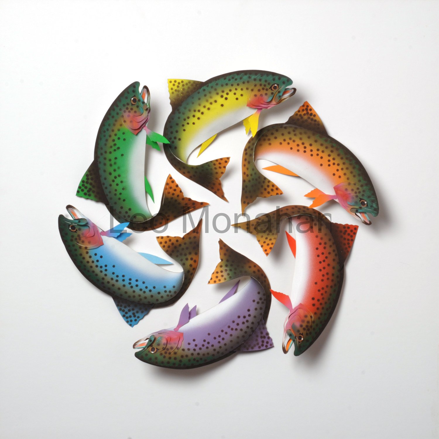
As you can see, I sculpted the trout realistically and painted the three primary and three secondary colors on their sides. I selected yellow, red, blue, orange, violet, and green to complete the color wheel. The colors are slightly modified or neutralized by the addition of white. The pattern that the tails make was serendipitous. Some things just happen happily. I like this one and won’t sell it, unless someone offers me some money. It reminds me of my childhood in the Black Hills. A trout stream ran through my back yard; where I used a willow fishing pole to drown a lot of worms until the older boys taught me to catch trout with my hands. The worm population was safe.
Paul Klee, who took over the course when Itten left, said that circles flowed, squares were calm and triangles were dynamic. The Trout color wheel certainly flows because of the spinning direction of the arrangement. Speckles on the trout are symbolic of any dot pattern on trout and the fish have a small white spot for the reflection on the eyes that indicate life. These trout could be any trout. The rainbow, in “Rainbow Trout,” is the wheel’s main concept.
I was in Berlin a few years ago and visited the Bauhaus Archive. I explained the Chouinard connection to the curator and he showed me through an exhibition of Paul Klee’s students’ work from the post-1923 foundation course. The students’ design problems were eerily similar to those at the Chouinard Art Institute. He was surprised to hear that Walter Gropius, founder of the Bauhaus, had visited Chouinard between the time that he brought the Bauhaus school to the United States and my arrival at the school. He spoke to the students at that time, but I was in Korea and missed it. Mrs. Chouinard, who founded the school, was ahead of a lot of other art educators, and we all loved her.
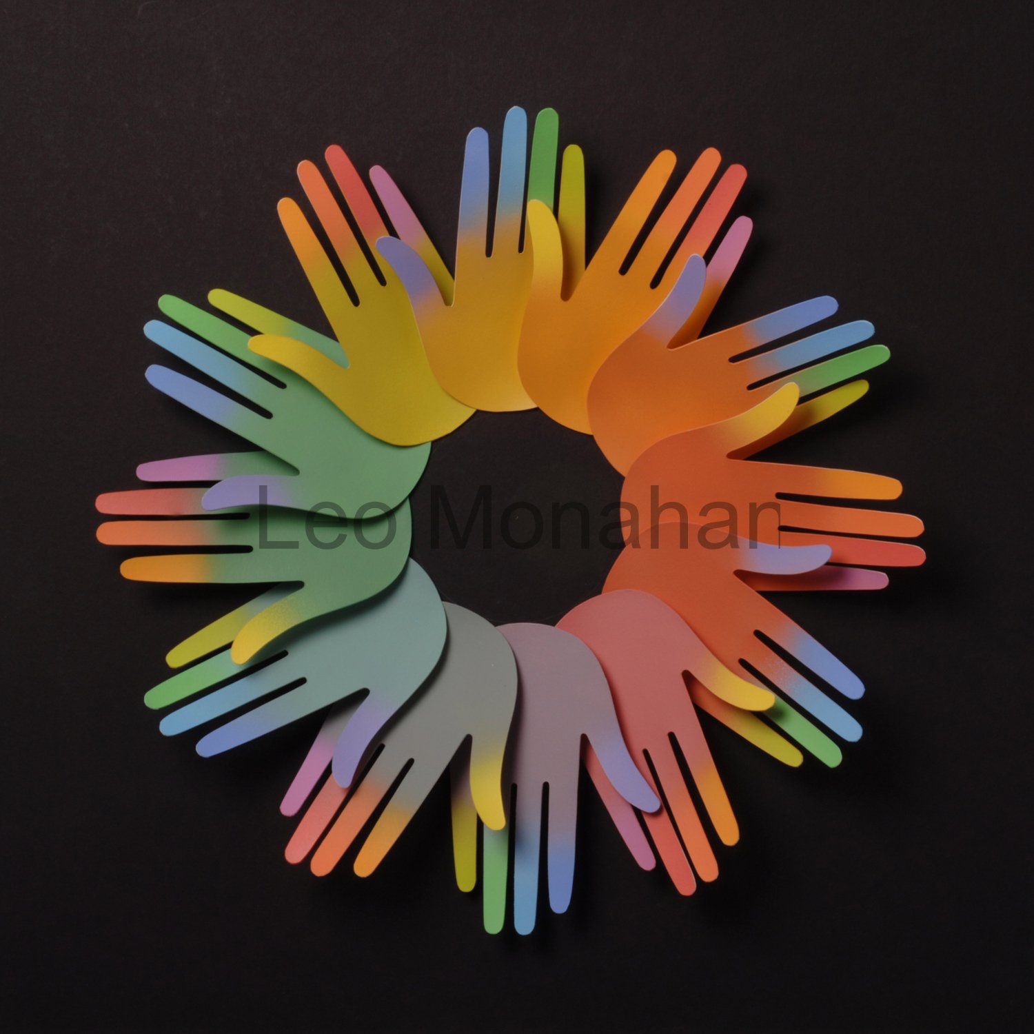
This “12 Hands” color wheel is another of the 24 color wheels in the series.
The repetition without variation of the hands seems simple on first blush but on further examination you will find six more color wheels other than the hands themselves. If you start at any yellow thumb and move right through ten fingers, you will see a ten-color series. I left out two colors in the 12 tone color wheel but I can’t remember which ones and, really, who gives a damn. The colors are tinted to about 80% of full intensity and the arrangement is mounted on black. White tends to diffuse color and black intensifies it. The trout were mounted on white for contrast because the fish are very dark. These are simple considerations but necessary for contextual continuity.

This piece was one of a twelve-bird calendar series done for Technocell, a German specialty paper company. I think this one, “Mocking Birds Mocking Flowers,” was for the month of May. I don’t know how many flowers there are but I just put on some Mozart, went into automatic mode and cut the damn things. They are all exactly the same and painted intense yellow with a few soft pink accents. Yellow is the most intense of all color. Pure sun! It can be hard to control because of its brilliance but, used as a subtle dimensional background, it works. The leaves are just two steps away on the color wheel, so they don’t visually interfere; they serve to enhance and identify the flowers.
As for the birds, this is one of those ‘watch what the hell you’re doing’ jobs.
I haven’t counted the number of shapes in each, but every bird has the right number. The birds are all the same so I only had to design them once, trace every shape, and cut them seven times. Thank the Force that I designed them all going the same way. These are ‘Leo’ birds and there’s not much that is accurate about them. Everyone believes they’re mocking birds, so I’m happy.
The color combinations on each bird vary and involve fully intense (bright) color. The hues are toned down by adjacent or direct complements and white. For me, I almost never use black, as the combination of color mixed with black makes for flat, lifeless color (although such combinations are occasionally useful for variations in neutral comparisons and is called “shading”).
Technocell took me, and the twelve paper sculptures, to Cologne, Germany, where the company displayed them in its booth at a huge paper and printing ‘messe’. It was the biggest damn show I’d ever seen. Ten of the twelve were purchased the first day. Another went to a designer in Germany and ‘July’ went to the head of Coca Cola in Japan. I got to visit that one while on a workshop trip to Tokyo where I worked with first-year students at the Tokyo Communication Arts schools. (I’ll talk about those trips in later blogs.) The topic was ‘Problems of Creativity’ for first-year art students.
Selling the original art meant that I got paid twice. I love art for money’s sake. There have been requests for sizes, prices and availability and I’m working on that, but most of the art I show is from my archive. In the next segment, I’ll show another color wheel and gallery art that came out of my childhood experience in South Dakota’s Black Hills.
Thanks for visiting with me…
leo
Leo, I hadn’t seen those cute little birdies before but enjoyed hunting through the images. I’m not done yet and will be back for another peek in the next day or two. Finding the hands was very timely because I’m in early stages of designing a piece for my studio that involves many hands, not uniform like yours, but varied in size. My concept is an intertwined circle of hands, all from life-sized tracings of our grandchildren, children and siblings. Three generations! Due to the limited size of the of the wall, it’s going to be the first time that the small size of our family will be an advantage. We haven’t been prolific breeders so I should be able to fit the finished work, including the frame, over the sofa. What luck! Now that I’ve seen your hand-y color wheel, I’m in the midst of readjusting my thinking about the colors. More inspiration from Leo. Thanks!
Really enjoying your enlightenment! You are so a born teacher.
However, the mocking bird piece did not appear on the blog.
Any chance of adding it?
WOW! great stuff and love the commentary.
Terrific to see your blog, Leo! If there is ever a chance of you making a brief return visit to LA, we need to go the Getty Center Research Center. I have a reader’s card. The reason is they possess one of the largest collections of Bauhaus student work in the world. It rivals Berlin. LA is probably the last thing on your mind and I cannot blame you. You’d really enjoy the Ellsworth Kelly and Richard Diebenkorn exhibits going on right now. Anyway, congratulations amigo! Good start blogging. Looking forward to the next one. By the way, the “Birds” image did not appear in my browser for some reason.
Just got the birds!
WOW Leo! Love your blog and colorful work. What was wrong with TU? So many conservationists would have appreciated your work so wonderfully displayed!! Keep it coming! Love the Rainbow Trout!
Wow! I vividly remember sweating blood building a color wheel for Bill Moore that radiated outward from saturated to neutralized in tiny squares. Each concentric circle had to maintain a consistent degree of neutrality. And that was using plain old tempera in the jar. No paint chips allowed, and needless to say no computer assistance.
I’ll have to pick up Itten’s book and arrange a trip to the Getty.
Leo, I didn’t see the “Birds” or the “Flowers” color wheel. Will you be showing them in a later Blog?
Thanks. I’ve seen it before. Sorry to say, this one is blurry. But the idea comes across. Keep them coming. Tchüß…
These pictures enimrd me of that Brad Pitt movie, A River Runs Through It. I think they were flyfishers, but it looked similar. I remember loving watching those scenes, something kinda spiritual about it all somehow. Maybe that sounds silly, but your images evoke that same kind of feel. Great work.
This is what we need – an isinght to make everyone think
ANOTHER COLOR THEORY: Max Lüscher
I’ve spent most of my life in Advertising and Publications. After I came home from Germany in 1965 and went into business with 2 other partners. Since the business dealt in advertising, I wanted to know more about color and how it related to ‘purchasing-power.’ I took several courses in psychology. During that time, I ran across a book on the psychology of color: The Lüscher Color Test. You can look him up on Wikipedia.com. So, when I designed packaging, displays, posters, etc. I always had Lüscher in mind.
When I started teaching advertising at Chaffey College 1984-86, and later fundamentals at Otis 1983-95, I used his theory. If anyone is interested in how color works psychologically, look him up on the web.
Good designing to all: Tchüß
Leo, of all the paper artists I have seen, you are by far the very best one. I love your colors, style, ideas, and talent. I am thankful to have met you, been in art shows with you, and being your friend. You will always be in my heart. Keep on enjoying your God given talent.
Leo – You are such a great writer. Technical knowledge – an art course – but defined easily and with some humor. Wish the birds had come up to see! You’ve given me a whole new way to look and appreciate color wheels.!