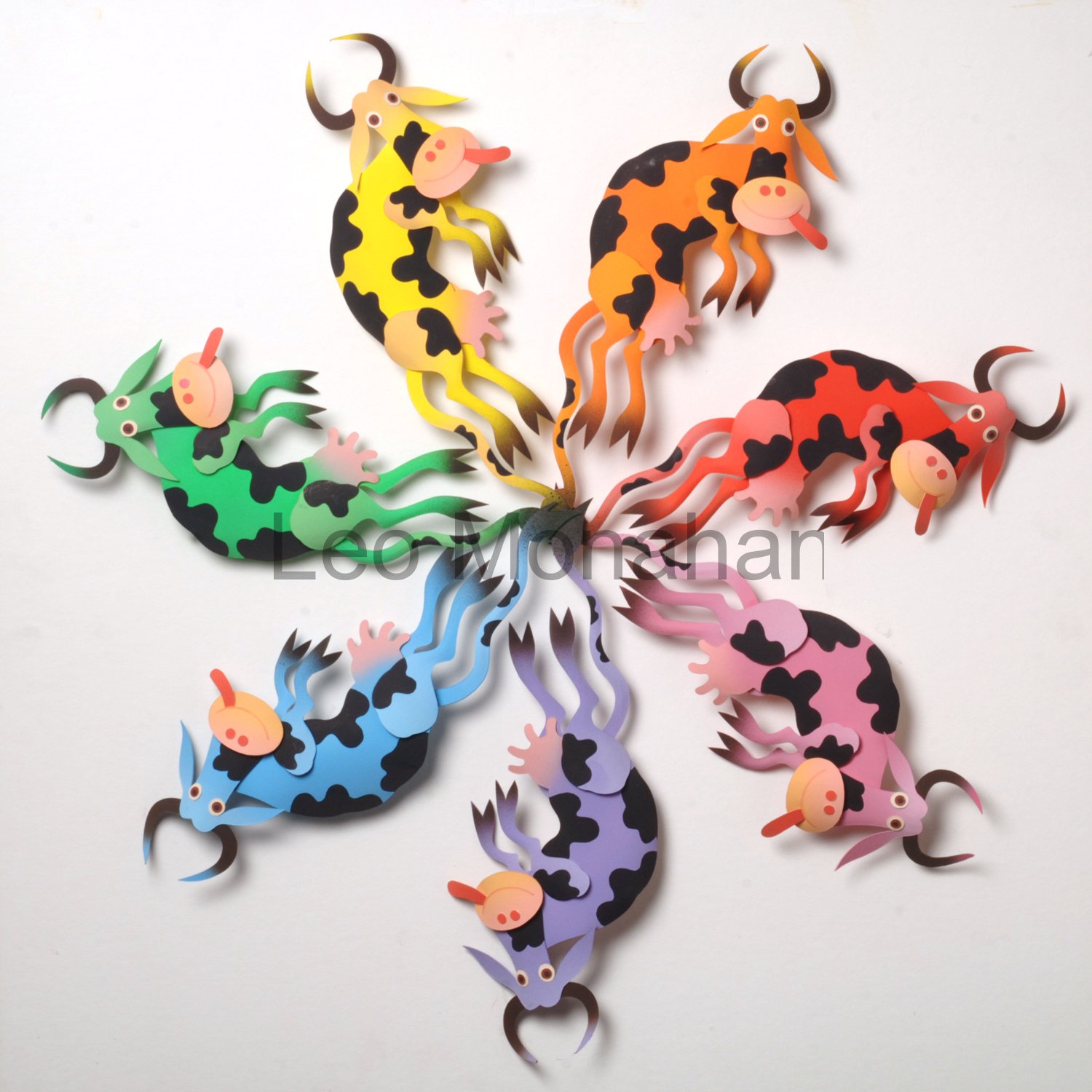
Dear Reader,
Have you seen some of the beautiful country kitchens in the design and decorating magazines? How lovely, how charming, but not at all the way that I remember farm and mining town kitchens in the 30s.
Things were there for utility, not for colorful charm. Black cast-iron wood stoves with chrome fittings and tin stovepipes that poked through the roof.
There was a rough wood box for kindling, a breadbox, tin containers with faded labels, pull-out bins for flour and cornmeal, faded curtains, wood countertops and a kitchen table with all the paint worn off, but very little color. The color I remember is the “dirty-thirties” green glass, which was awful.
The kitchens were well stocked, but everything was faded from age and hard use, especially the pots and pans that were beat-up cast-iron, tin and copper. There were wooden spoons, forks and spatulas for cooking, and mismatched “silverware” for the table. There were plenty of ceramic mixing bowls, soup bowls and plates for family, friends and farm hands, and the kitchen was the warmest room in the house, summer and winter. I loved being there.
Water came from a well with a hand pump by the sink or a larger pump outside that had to be primed and pumped. Sometimes, the sink was wood and water drained into a “slop-bucket.” In the back yard was our two-holer.
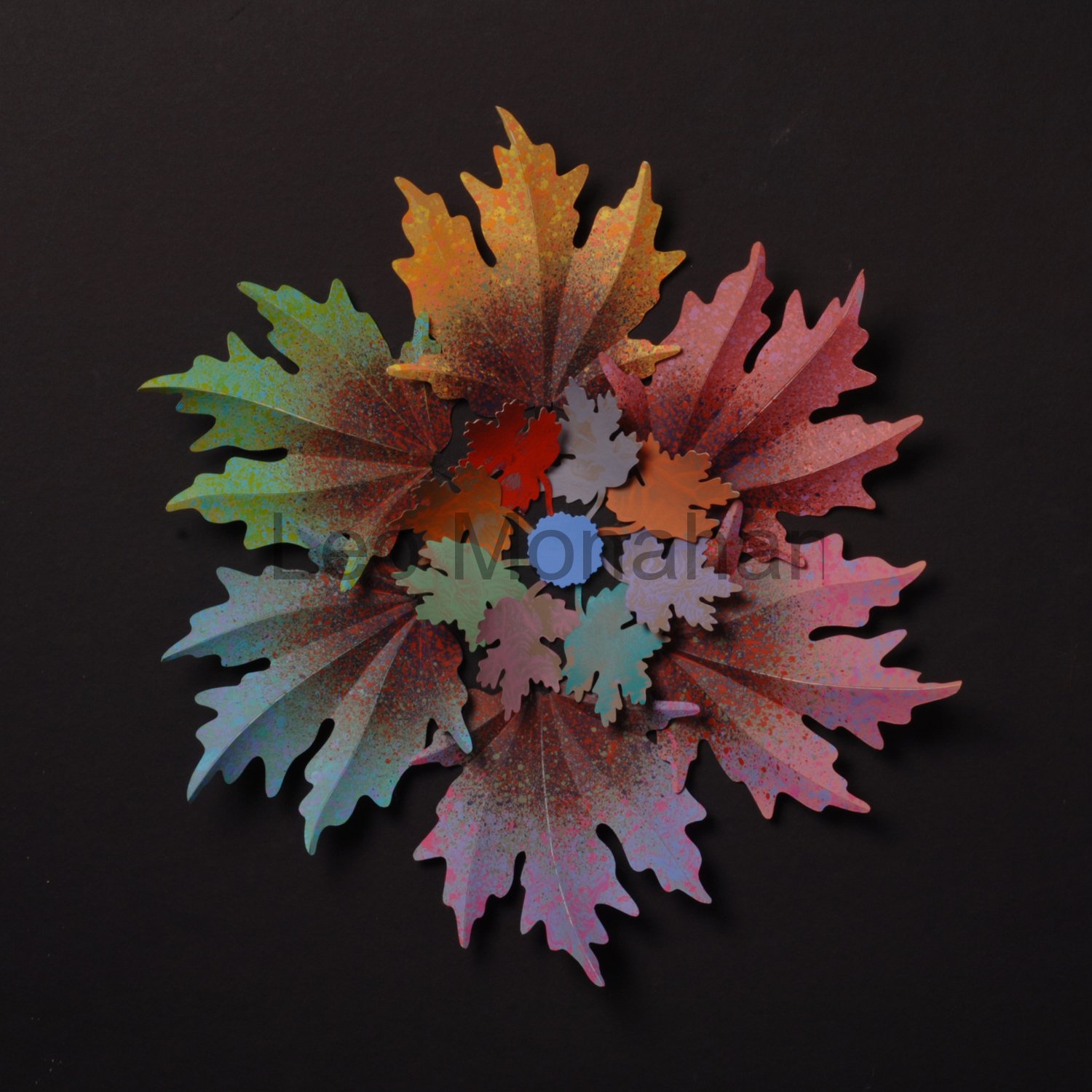
This rustic, autumn leaf color wheel is a combination of pale and dark color schemes.
The six primary and secondary colors were tinted, then toned down slightly with subtle sponged-on texture. This texture, a splatter of neutral colors and black, frames an arrangement of small, randomly colored leaves. Seems appropriate for today’s subject.

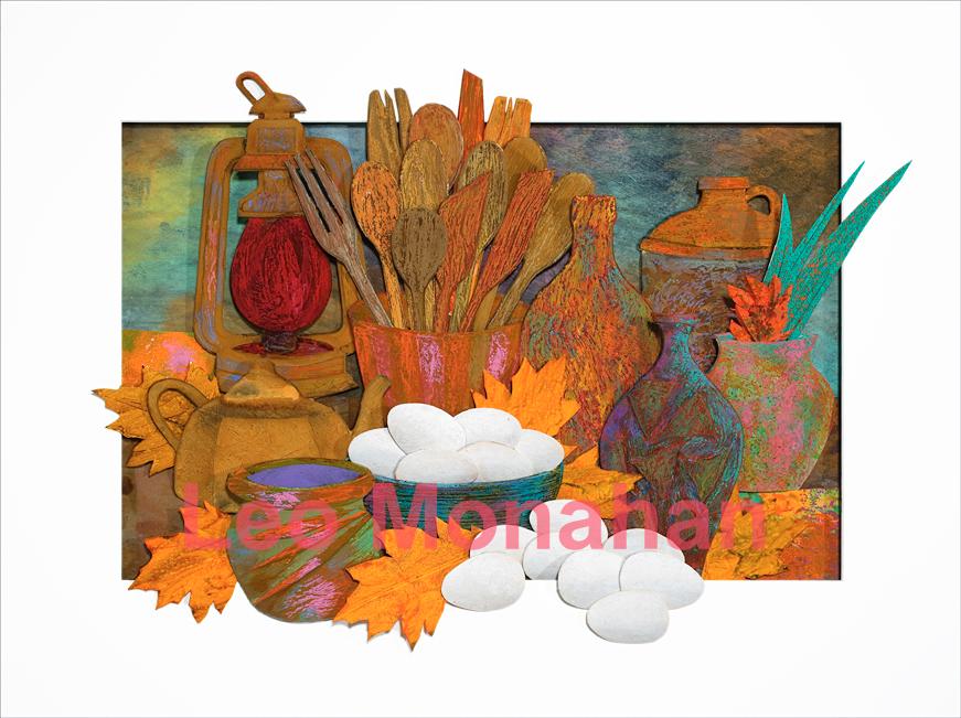
Country Kitchen
I start these kitchen still-life sculptures by cutting, texturing and painting dozens of bowls, vases, lanterns, tins, implements and foods, not knowing how they will be used. I choose from this large inventory when composing a piece. (I still have several boxes of kitchen elements left over.) I seldom cut and finish something just for a composition. The first example is a dark, earthy color scheme using a wide range of neutral colors that are enhanced with oil pastels after everything is in place; the paper is mostly acid-free museum board that is sometimes used as mat board for framing. The board is difficult to cut on a bias.

Country Kitchen
Everything is old and beat up in this composition, and the enamel is almost all chipped off the coffee pot, leaving rust and wear. The color scheme is warm and tinted neutrals.
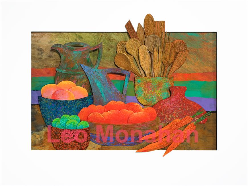
Country Kitchen
Very close values in the yellow-yellow orange range of neutral colors are balanced by small, cool, blue and blue-green elements. The rusts are made of iron in fluid that is sprayed with a reactive agent that makes it rust.
Country Kitchen
The color scheme above combines dark, intense hot color with dark neutral cool hues. The values (dark and light) are very close across the entire spectrum. Several intense yellow, green and blue elements are the transition and balance between the two extremes.
Country Kitchen
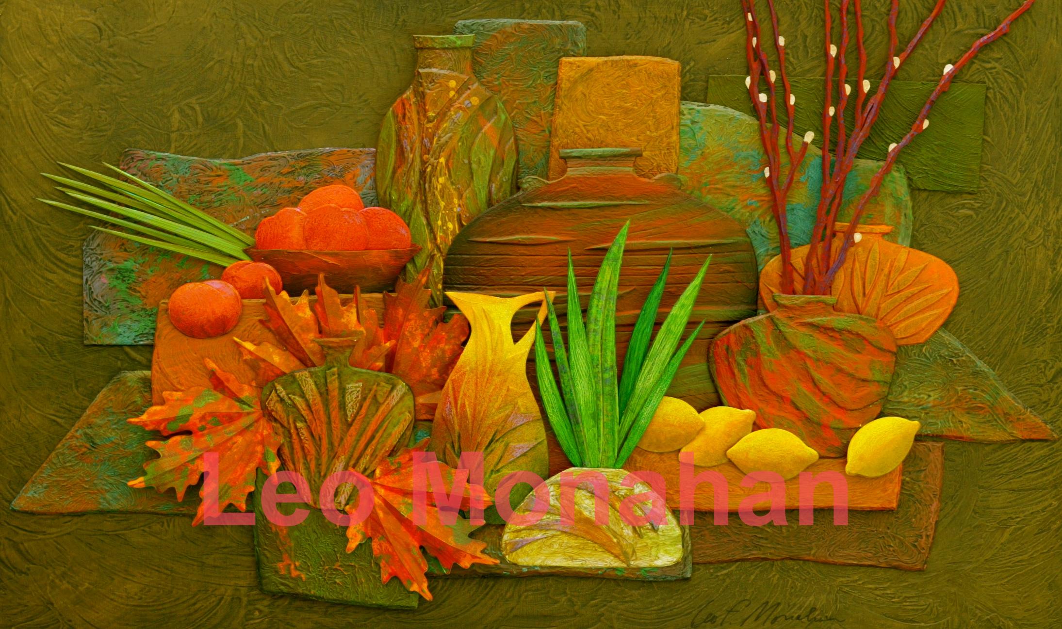
The country kitchen still life displays the prevailing features of my technique. The work exhibits close value and warm and cool comparisons. In a sea of dark, neutral, cool hues, an arrangement of hot elements on the left side of the composition is balanced by smaller warm objects on the right. The focal point is the central grouping of a bright, yellow pitcher, lemons and a vase with a grouping of bright green leaves for cool relief …aaaaahhhhhhhh…..
That’s quite a lot for the moment. I think I’ll make a peanut butter sandwich and have a cool glass of freshly churned buttermilk…aaaaaaahhhhhhhh……
Thanks for visiting me.
leo
Country Kitchen #3, 26″ x 20″, is available at the Cut, Bend, Fold, ColorColorColor exhibit at the Grovewood Gallery. $2000.
Other kitchen sculptures are available at the Cut, Bend, Fold, ColorColorColor exhibit at the Grovewood Gallery in Asheville, NC.