Ice Cream Dreams

Dear reader,

Spring, and the air here in the mountains is delicious. The flowering trees are white, pink, and violet. Blooms are coming up and we have to mow the damn grass every week. I think I’m going to plant invasives, they seem to do so well. Tons of pollen in the air, but allergy isn’t my problem. I wanted to raise chickens, so I planted a row of eggs every ten inches and about four inches deep. I fertilized and watered them regularly but nothing came up, so I wrote to the county agriculture department, told them my sad story and asked them to solve my dilemma. They came out and took a soil sample. No chickens, but I met some nice people.

Spring is the season when, as a boy, I could always collect the penny deposit on pop bottles and buy a big, side-by-side, double-dip ice cream cone. I took my shoes off about the same time, and none of us boys put them back on until snow fly. There were some 250 people strung along five miles of creek at Keystone, SD. Although lots of them had cows, ice cream was dear because of the sugar rationing during the war. All the men had gone off to fight, and we boys lived like Huckleberry Finn. Work had stopped on Mount Rushmore, and it looks now pretty much like it did then.

Leo Monahan Paper Sculpture

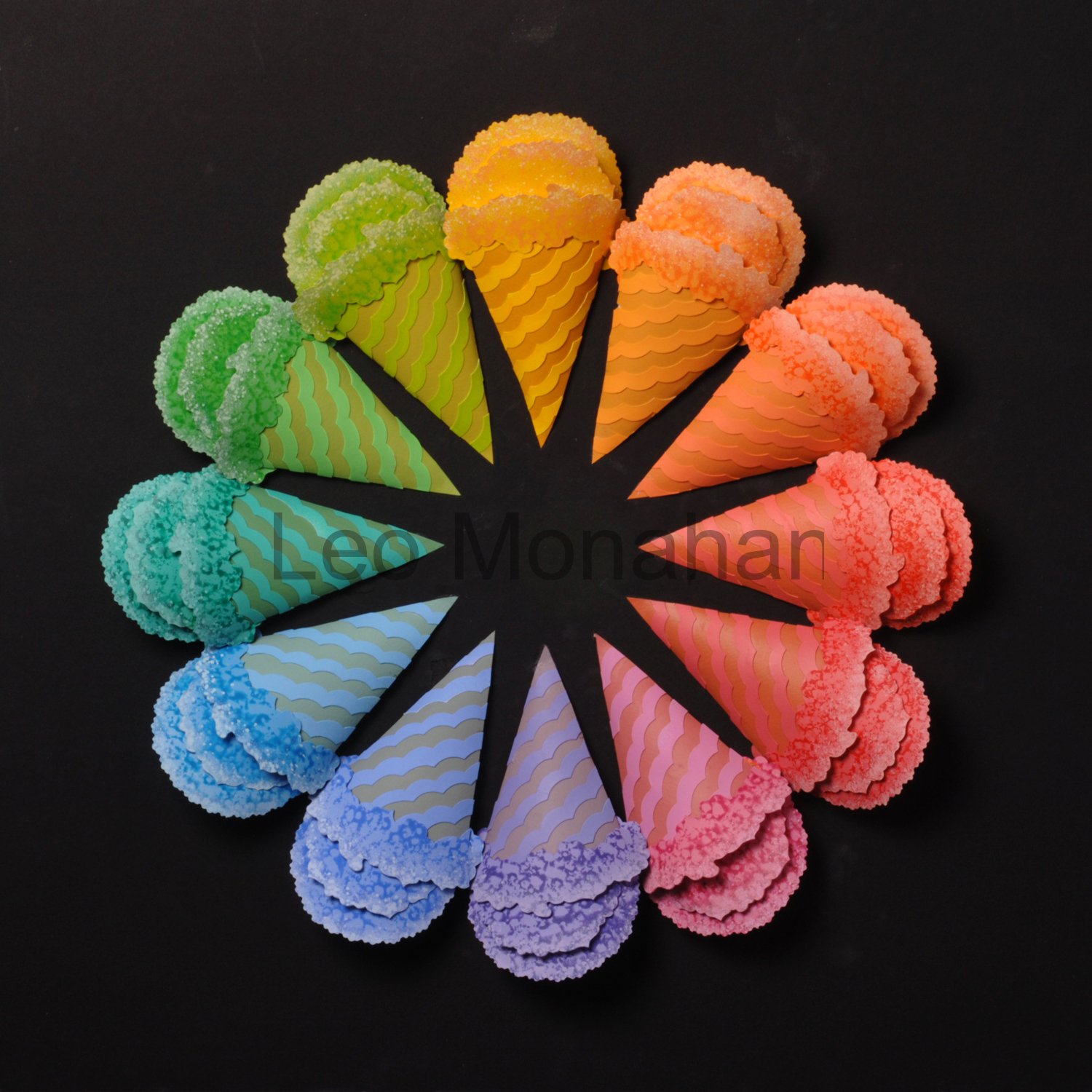
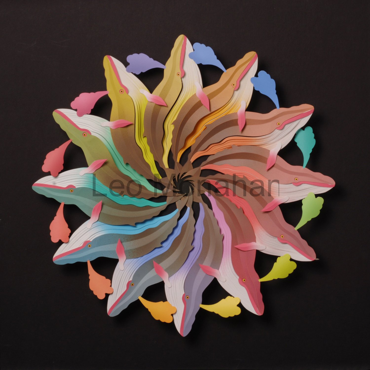
Ice cream cones like these are my fantasy. Ice cream of every color and flavor warms my heart and gives me a headache just above the eyes. The cones here are all 12 colors of the color wheel. Each ice cream and its cone are the same color. The ice cream is outlined with a texture of white to indicate dimension, and the cones have stripes painted in the same color but toned down slightly with a complement. The cones are curved to give dimension and produce soft shadows when viewed or photographed.

A very simple image, but the memories it brings up from my childhood are unforgettable. Like the time I found a 50 cent piece in the dusty street in front of the small post office in Keystone. I went into the post office and showed it to Mr. Manion, the postmaster and only employee. He said that I should buy five, 10-cent saving stamps toward a $25 war bond. We were all saving stamps, and I’ll be damned if I didn’t do it instead of getting a whole bunch of ice cream cones. 50-cents would be like finding a fortune now, if you think back that hamburgers cost a dime in the 40s.

img_0208

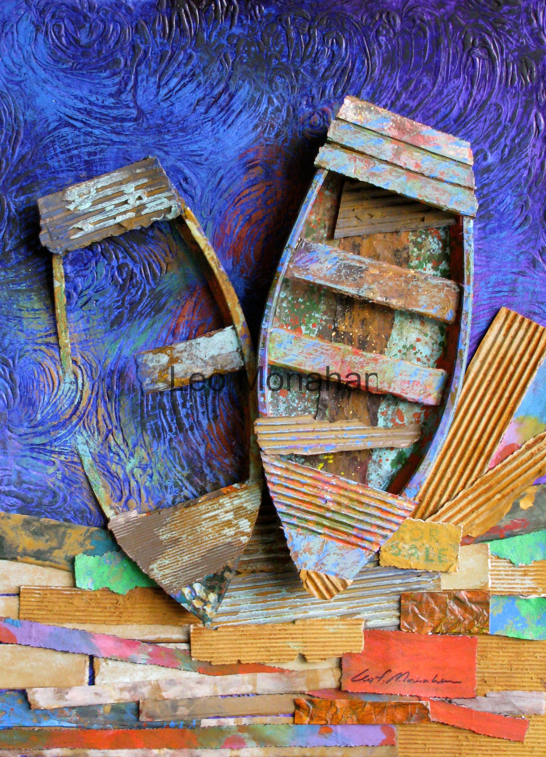
Keystone was an old gold rush town and everything was old, rusty, broken or falling down. A cold mountain “crick” flowed through town and was our main playground; swimming holes in the summer, and ice-skating in winter. There are several lakes in the hills nearby, and we commonly walked six miles to Horsethief Lake to dare each other to swim across. Not me; that was the coldest damn water I can remember. There, tied to trees, were always a lot of beat-up rowboats, half full of water or sunk all together.

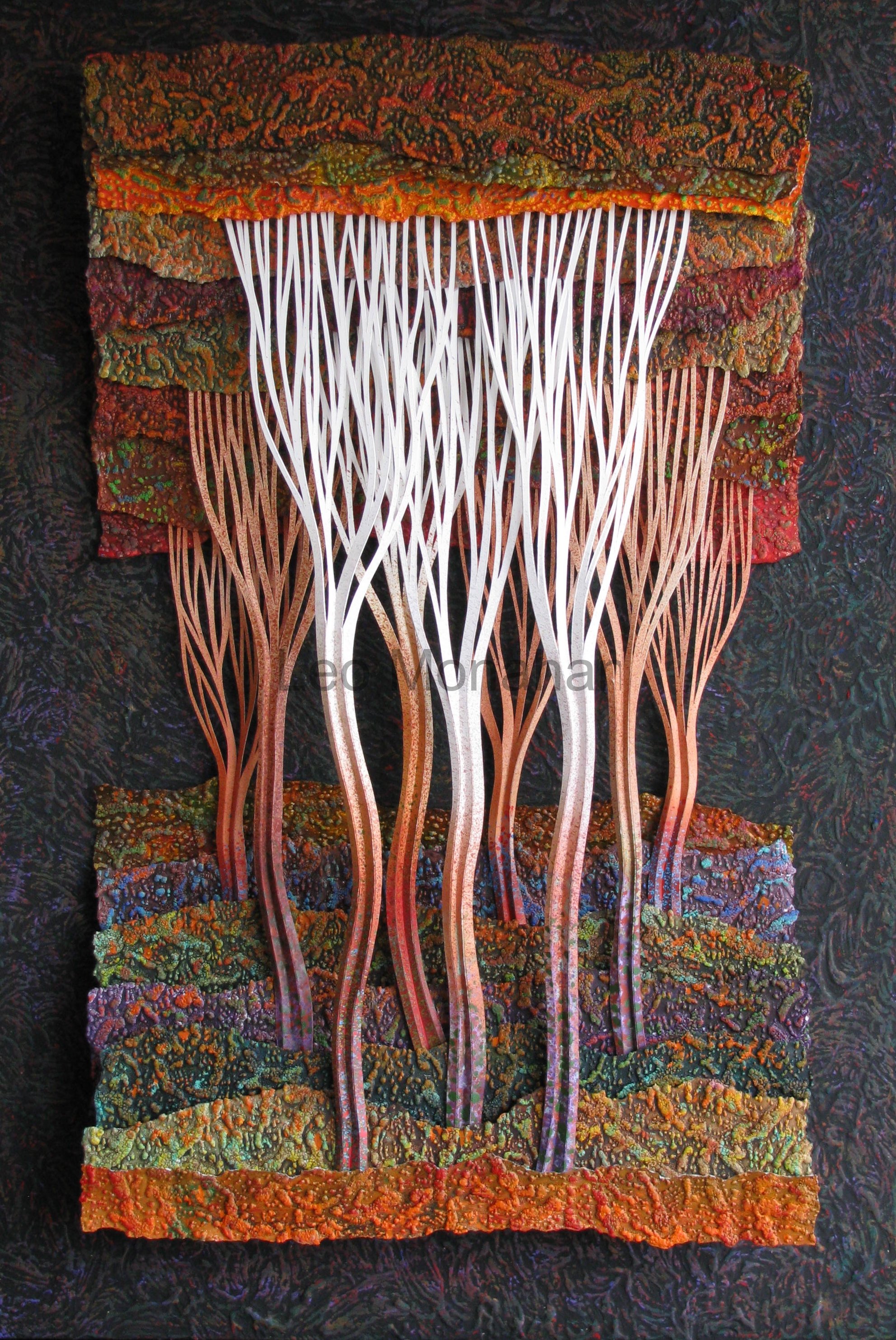
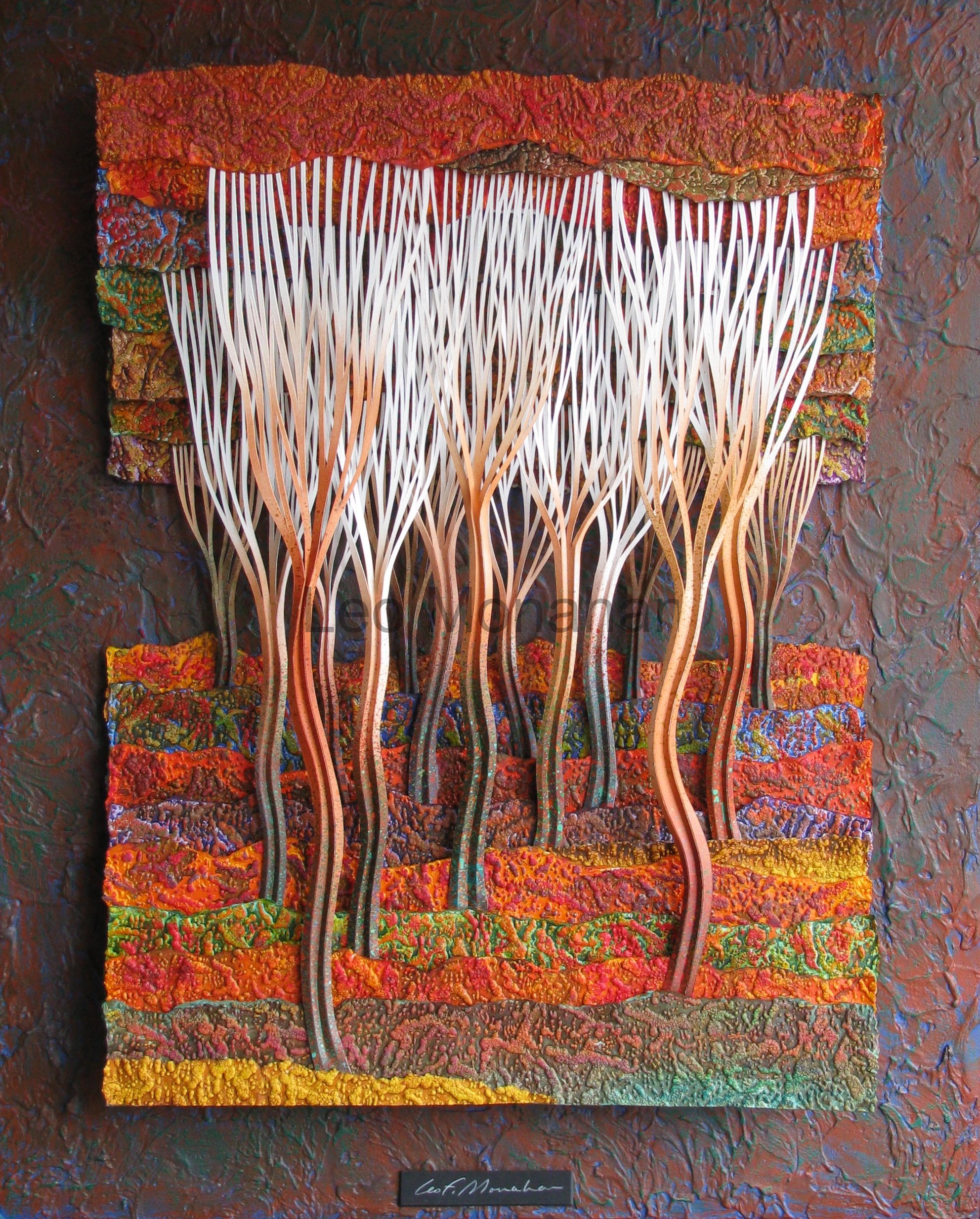
I love the texture of age. Rust, corrosion, peeling paint and rot are my palette. This is a small piece, 16 x 20”, and strong direction is not the intent. The conditions, contrasts, textures and story behind the boats are the topic. The colors of the boats are predominantly warm, with some cool accents to enhance the effect. Every form of corrosion that I could devise is in there. The water is dark, intense blue to contrast with the boats and trash on the dock. The colors on the boats and trash are all neutral, while the water, trying to be pure, reflects a summer sky. The sunken boat is strictly for story.

“Fred, dammit! Who let my boat sink like that there? Yours seems to be holding up, piece of crap that it is. Mine’s in better shape, but the sonofabitch is under water, as any boat-sinking idiot can plainly see. Have your boys been playing out here again? Last time they busted the oars. Dammit, where’re those oars anyways?”

“Jimmy, we go through this ever year. Let’s pull it up, get the water out and patch the damn thing up again. Last time I saw the oars, you used them to hold up your chicken house roof. As a fact, where in hell are my oars?

They better not be part of your chicken shed. To hell with it all, it’s too damn hot to be out here. Let’s open a couple of them beers and set awhile.”

“Ok, we’ll go to my place and get the oars later.”

Thanks for visiting me. Same old stuff next time…

leo

Jimmy’s Boat 17.5 x23.5″ is available for $2500 at the Cut, Bend, Fold, ColorColorColor exhibit at the Grovewood Gallery.  The Ice Cream Cones are not available.


Whales in the Forest

Dear reader,

When I moved to the mountains in Western North Carolina, my palette became warmer because of autumn. The mountains go crazy with color in the fall and won’t be ignored. When I was a boy in the Black Hills, autumn came on a Wednesday and then we had three feet of snow for the weekend. Besides, Ponderosa pine needles don’t change color so there was no change from summer to winter. I lived in Los Angeles and we had four seasons, but they were fire, flood, earthquake and riot. There was no autumn influence in my fifty-year incarceration there.

The personal choice of color is subjective, and we choose color that makes us comfortable. Professional colorists select it to affect emotion, comfort, purchasing, identification and a myriad of results. Artists of every stripe can be objective in color selection to solve problems or accomplish goals, but personal color selection is subjective. Warm color preference is my style and “my style” has been called “the sum of my bad habits.” Now and then, I’ll do a dominantly cool piece, which I usually set aside for a period of time and view with suspicion.

When I got to North Carolina, my wife already had painters working on the living room. They were using a good white and two soft neutrals of the beige persuasion. I’m not comfortable in a visually safe, monochromatic environment so I added a bright, chrome yellow for a wall in the large entrance, a bathroom, two walls in my studio and as accents around the kitchen windows and the fireplace.

When the painters picked up the yellow paint the clerk asked if they were going to paint lines down the highway. But when the job was finished one of them said, “Mr. Monahan, I thought it would be garish, but it works!” I explained that it was the amount of yellow that we used. The contrasts of amounts used (variation of proportion) is the primary consideration in every choice of any element in art. My definition of design for any art is the study of proportion. Big is big when compared to something small, red is brightest when compared with a touch of green, and so on and on and on. Name any art and I’ll show you how the artist has used variations of proportion.

Leo Monahan Paper Sculpture

I began designing the “Spouting Whales” color wheel’s variation of proportion by thinking about a whale’s physique. It is bodied with undulating shapes starting at the nose and ending at the tail in a spiral. The overlapping whales assume hidden bulk. The underbody blends from white into tints (the addition of white) into pure color in a smaller proportion than the upper body, which starts with a modified or neutral version of the same color that blends into a darker value (dark & light) at the center. I toned down the colors with the addition of the direct complement (the opposite side of the color wheel). This is getting “teachy,” but I don’t have another way of describing things. The darker body color is blended with raw umber, an earth tone.

The spouts are the direct complement of the underbelly. For example, the violet whale at the bottom has a yellow spout and the yellow whale at the top has a violet spout. The star shape in the center is visually insistent and the eye starts there then moves out in large spiral shapes and is rewarded by the small accents of the bright spouts. All of the hues (color) have been tinted with white to about 75% for contrast, and the whole wheel is mounted on black to enhance the colors.

Joseph Albers, who had been a Bauhaus student under Itten, modified the color course from what it had been under Paul Klee and Kankinsky, expanded it to a full year and put it into the rational system that I studied under Bill Moore and then taught for many years. Albers was one of the instructors who came to America after the Nazis closed the school and he worked, taught here, and became the famous painter that we know. The list of famous artists that came out of the Bauhaus is impressive to say the least.
Read the history.

img_0216

Aspen groves grew near water and took over when forest fires killed the pines. They were favorite places to play when I was a boy in the Black Hills. They could be deep and dark, white but non-threatening. The first forest is narrow (20×30”), and has a strong vertical thrust which is enhanced by the tall narrow trees that move up from dark to light. The negative spaces between the three main trees are very strong, wavy flames that point up to reinforce the vertical direction. Referring back to the list of elements and coordinating principles, the layout is the dominantly vertical direction of trees with a horizontal subordinate of landscape.

The color is limited to variations on earth colors, burnt sienna, raw sienna, burnt umber and raw umber. I don’t use them right out of the tube; I add small amounts of color to give them character. There are dozens of bright color accents in the shapes of the forest floor. The paper is heavily embossed and painted in variations of the earth tones. The color accents hit the higher embossed shapes.

The values (dark and light) are dominantly dark with a subordinate use of white, but the white trees make up the main interest with their negative spaces and textural overlay.

img_0219

This forest has a more passive direction (24×30”). While the elements and techniques are the same, the intent is to pull you into the forest instead of up into the top of the trees. The visual flow is along the strong diagonal tree arrangement as they recede among the overlapping horizontal landscape shapes. It’s the same forest with different ideas.

“I wonder whom these woods belong to. I’m not sure I’ll walk through there even though it would be a short cut. It’s dark and gloomy with rough rocky ground and brush. What if I fell and injured myself? No one would ever find me. Wait…what was that? I think I saw something moving. Just another reason not to go in there but it’s probably my imagination. No, dammit, there’s something in there…Oh, jeez, it’s two little boys and a dog.”

“What were you doing in there boys? Is that dog friendly, will he bite?”

“We always play there and my dog will lick you all over. Do you walk in the woods mister?”

“Oh sure, I’m in there a lot, I just I love the deep, dark woods. Big people aren’t afraid of places like this y’know. I’m not going through this time but when I’m here again, I’ll just traipse right in there and wander around and have a lot of fun.”

“Ok mister, we gotta go home for lunch. G’bye.”

“G’bye boys…. Jeez.”


Thanks for visiting with me…

leo

The first Forest, Black Hill I, just sold. The second forest, Black Hills II, is available for $3200 at the Cut, Bend, Fold, ColorColorColor exhibit at the Grovewood Gallery in Asheville, NC.