Dear reader,
It’s still that sweet time of year when it rains regularly and the earthworms come out to keep from drowning. Why did we call them angleworms? We dug them up behind barns, in that kind of soil, and put them into a flat Sir Walter Raleigh tobacco can, and gone fishing. Well, no matter what the worms are called, the robins are getting as fat as groundhogs in a bean field. Go rockin’ Robin cause we’re really gonna rock tonight!
When I designed this color wheel I thought of robins’ inalienable rights. The right to be a robin blue breast as well as a robin red breast. Some of them would probably wear plaid or polka dots if they were available. Robin paisley breast or robin tie-dye breast would look outstanding, but white with a black bow tie for eveningwear would be so gauche.
Did you know that the French don’t have a word for gauche?
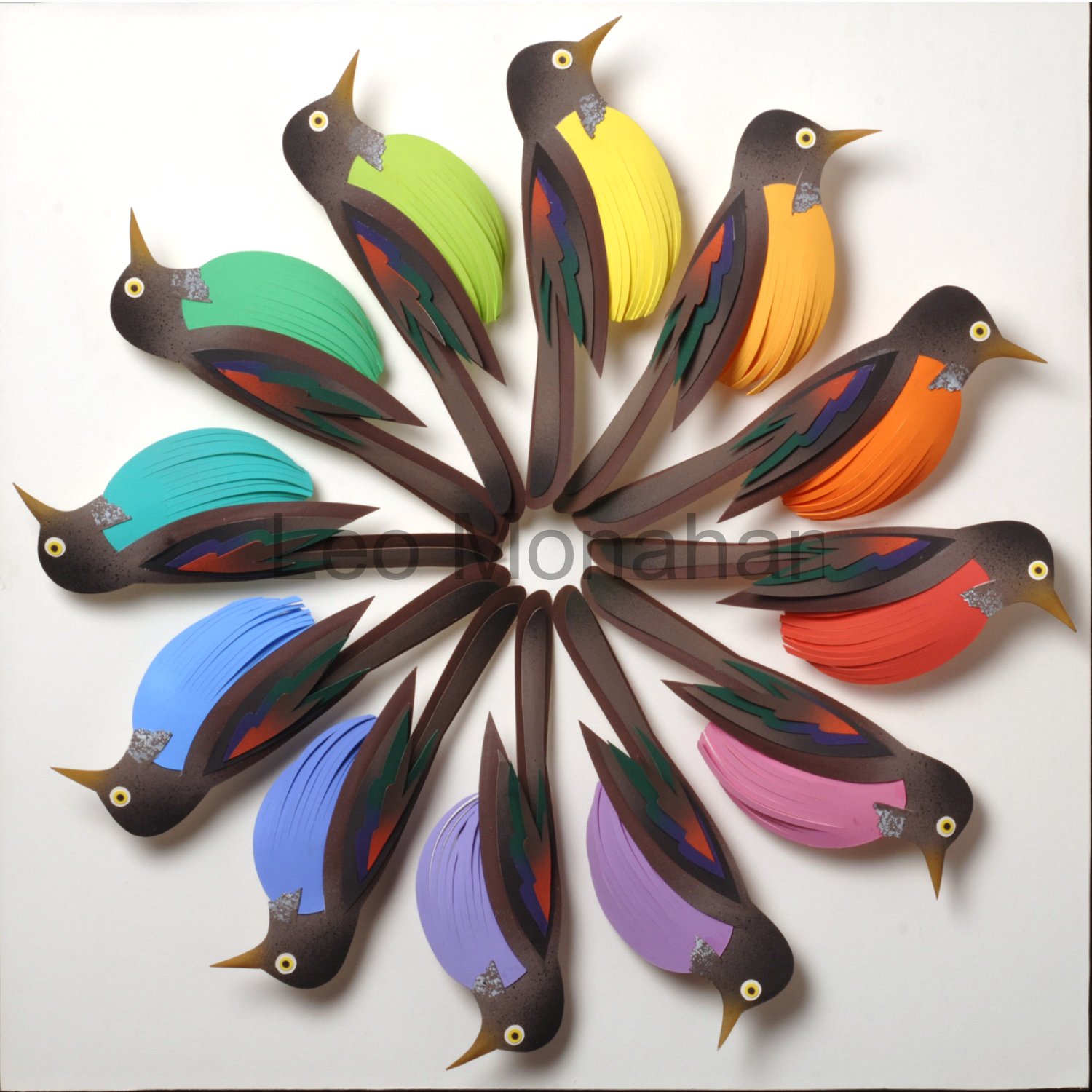
The robins’ breasts are intense colors slightly tinted by the addition of white for clarity.
The 12 hues in the color wheel were named so they could be easily remembered. The spectrum starts from ultraviolet and leaves as infrared. Simple names: yellow, yellow orange, orange, red orange, red, red violet (magenta), violet, blue violet, blue, blue green, green, yellow green. Yellow is in the center of the spectrum and is the brightest, most intense color. Itten said that 12 colors were easy to remember, and didn’t think anyone could describe number 84 in a 100-color wheel.
The robins’ body feathers are a restrained combination of dark earth tones and black, with a touch of deep green and dark red accents on the wings, to contrast with the bright colors and the white background. The breasts are the main symbol, so the feathers were cut in simple linear shapes, with long tail feathers that meet at the center.
When I was a boy, the robin was my favorite bird. They came early, were big and bold, strutted around with worms hanging from their beaks, and didn’t seem to take crap from anyone. In spite of the angleworms, I would prefer to come back as a robin in my grandpa’s back yard. I wish I was a kid again, doin’ what I did again, singin’ a song.
When the red, red robin goes bob-bob-bobbin along.
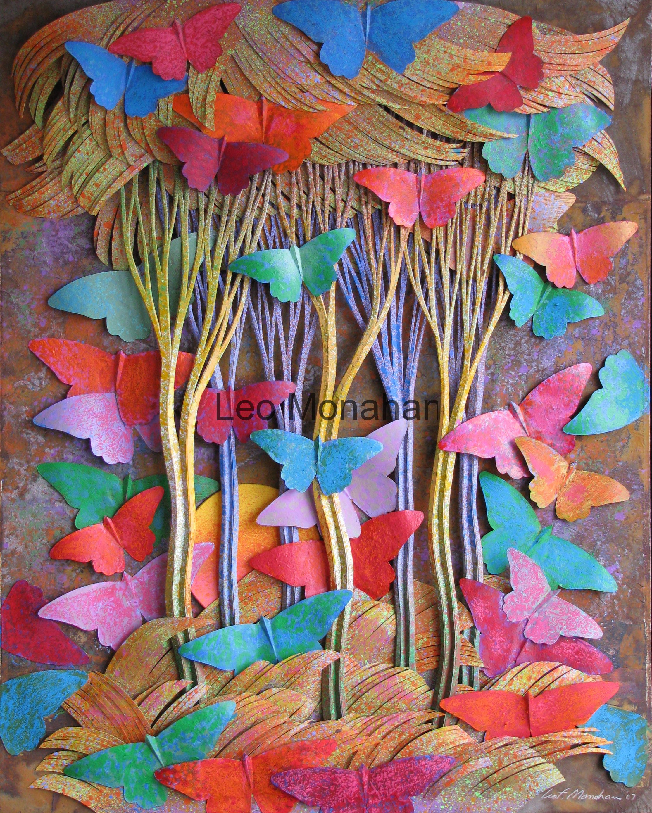
Butterflies, mama nature’s tiny wing wavers. It has been said that when a mariposa waves its wings in Argentina, the result is a hurricane in Haiti. We have to find that butterfly and stop it!
It seems that every language has a sweet name for this bug: mariposa in Spanish, schmetterling in German and butterfly in our own. Everyone loves this flying eye candy. When designing the image above, I had to control the very decorative quality of the butterflies. If I had designed each butterfly with unique decorative patterns on the wings,
it would have been a visual disaster. The result would have been a freckled forest.
I cut, painted, manipulated and assembled the trees and other forest elements into a finished work that could stand on its own as the symbol of a forest in the fall. The dominant color range is warm, the trees are the major shape system, the indicated depth of the scene is shallow, and the value range is in the middle of dark to light. The forest becomes a containing device for the butterflies.
The basic shapes of the butterflies are a simple silhouette symbol that everyone can recognize. The sizes are nearly all the same because the range of variation had to be in color and placement. The forest is made up of a range of warm, neutral hues that contrast with the intense (pure) quality of the colors of the butterflies. The butterfly wings are all slightly textured. with numerous other colors in small amounts (proportion) to relate to the textured surfaces of the forest. Hopefully, the result is an explosion of color in the autumn, when the butterflies migrate, or become one with the leaves on the forest floor.
Thanks for visiting me…
Leo
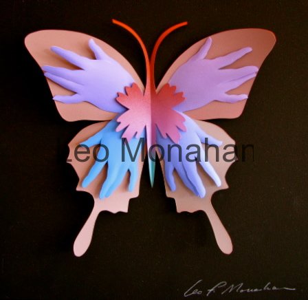
Four versions of “Butterfly Hands” are available at $300. each. 12×12”
leomonahan@tds.net
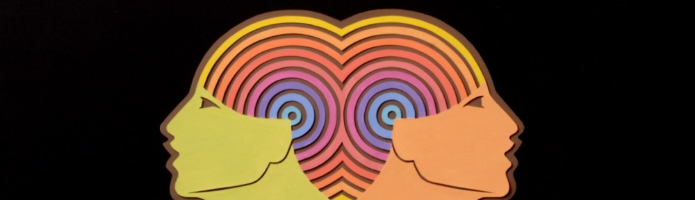
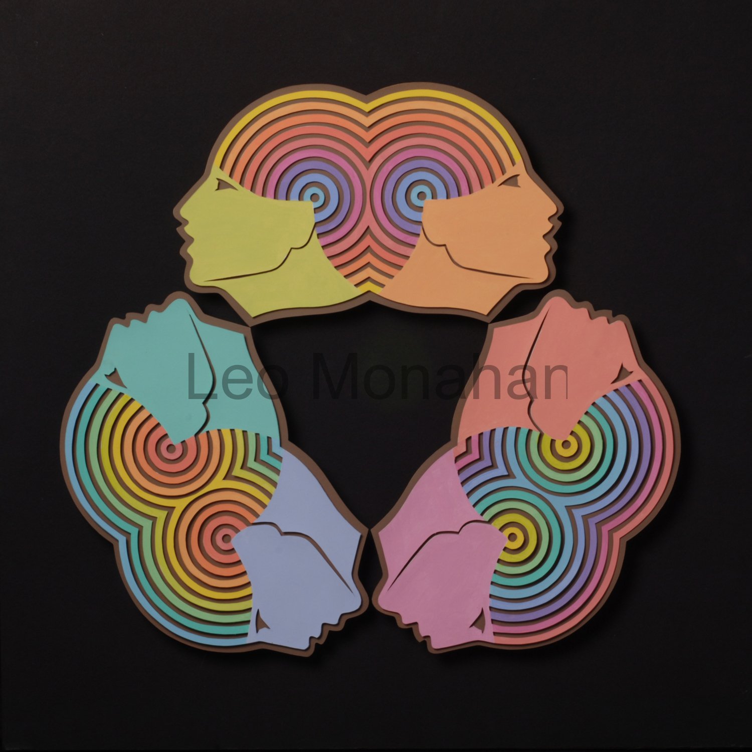 Along with other work, I will show and talk about each of my color wheels as blogs go by. The Faces logo for this blog is one of them. This one was a briar patch, but I had to finish it because I liked the concept. The six faces are tinted primary and secondary colors. The circular head-pieces are tinted color wheels, each head having a different color in the center and moving out through the spectrum. This was a ‘measure thrice, paint once’, proposition. I really had to focus to know where I was in the process.
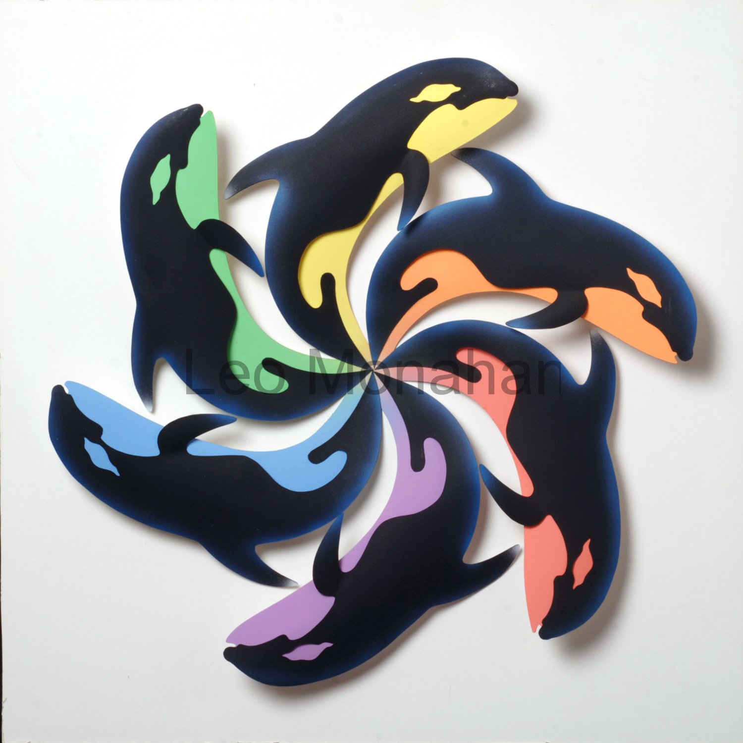 One of my favorites is “Color Whales,” because I do love a pun. Six Killer Whales are arranged in a circle with their bellies painted in tinted primary and secondary colors, yellow, red, blue, orange, violet, green, to contrast with the black bodies. As we go along, I’ll talk about the many ways of neutralizing color; tinting is one of them.