Running Through Sheets

Dear Reader,

Did’ja ever run past Mrs. Tackaberry’s house where the Chow Chow dogs charge the fence to eat kids? Then run down the sidewalk into the Thompsons’ big backyard where clotheslines are strung all over, and the bright, white sheets are waving like sails and the colored clothes are snapping in the wind?

We ran with arms outstretched through the sheets as they wafted over us. Then Mrs. Thompson, who worked all Monday, washday, to get the clothes out in the sun, would chase us away.

Hot day, boys running
Into wind-whipped, bright white sheets.
Dodging colored clothes.

We lived a mile high in the Black Hills and the air was clean, the sky pure blue, and the grass bright green. The sky, the grass, and those colored clothes whipping and snapping in the wind are my early memories of color.

Clothespins and clotheslines,
Smooth, clean sheets across my face.
Smell of fresh laundry. 
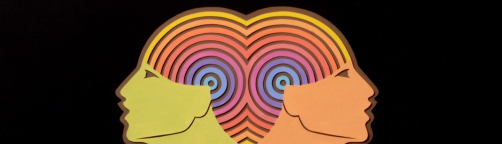
Rhino Color Wheel

The rhino color wheel was designed like a child’s toy, and the center “fan” is an intense but dark color wheel of primary and secondary colors. The horns are also of high intensity but isolated and brighter; they’re like handles for throwing the toy in a game.

I start each blog with a color wheel because, for me, it symbolizes the Bauhaus, about which Mies van der Rohe said: “The fact that it was an idea, I think, is the cause of this enormous influence the Bauhaus had on every progressive school around the globe.
Only an idea spreads so far.”

I was five years old when running through the sheets and didn’t know, or care, that the Bauhaus had been closed for five years and many of the famous instructors had fled Germany to America, where they re-opened the school.

Twenty years later, I was immersed in Johannes Itten’s color system, refined by Kandinsky, Paul Klee, and Josef Albers, who fortunately organized it into a cohesive method. I have studied, taught and used this system for the past 55 years, and it allows me to organize, innovate, experiment, and be more than happy with the surprising results.
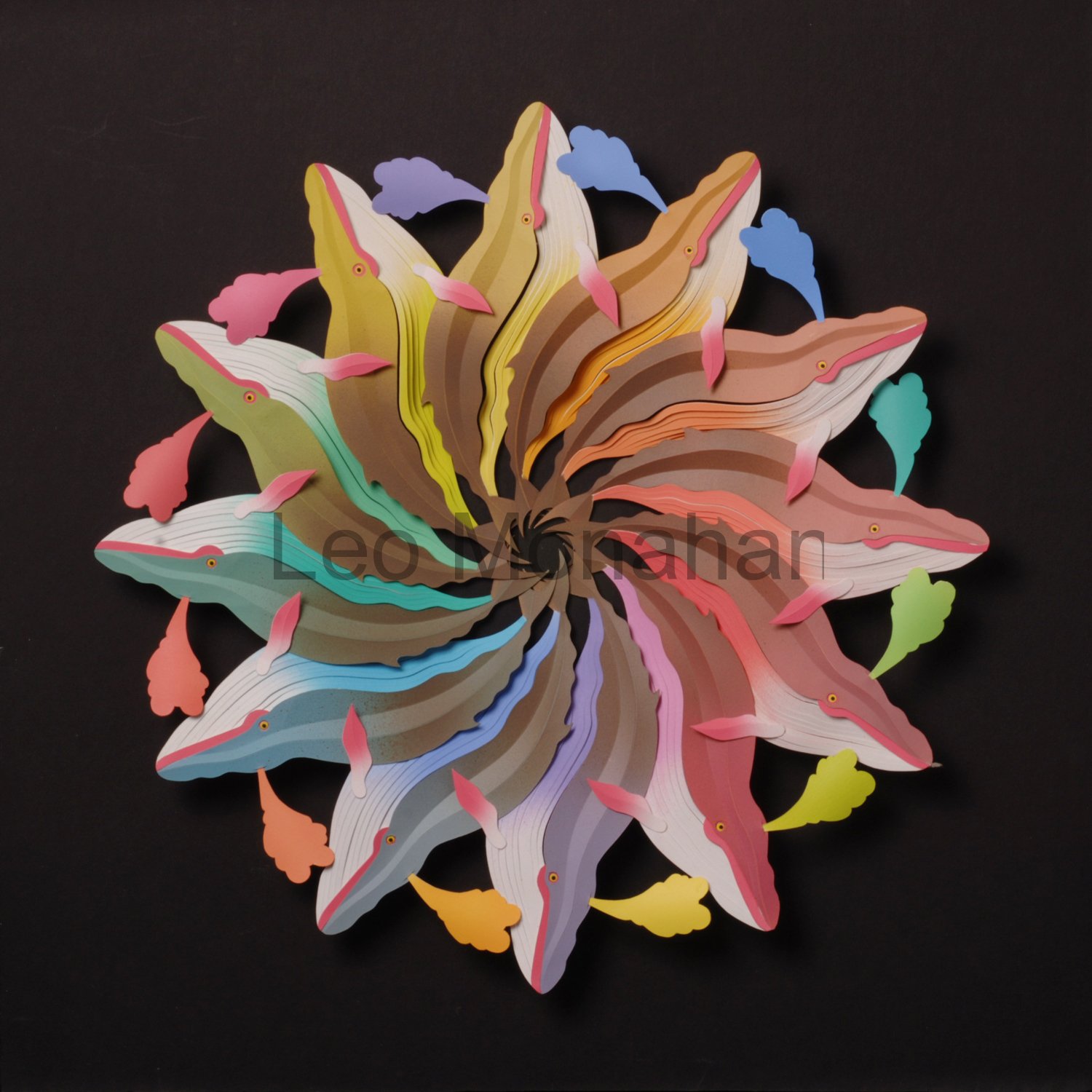
Abstract #1

This nostalgic image is my version of Mrs. Thompson’s backyard. Full of color and white sheets, all waving, and snapping in the wind on a hot, clear summer day.

I cut a couple hundred shapes from museum (mat) board, without a plan or intention, and put them aside. Later, I paint them in many colors, again not knowing how I’ll use them, and put them away in a box.

When I get around to assembling them into a composition, it’s like I’ve found a treasure trove that someone has prepared for me. I move the colored shapes around for a couple of days and finally glue them down and varnish them for protection.

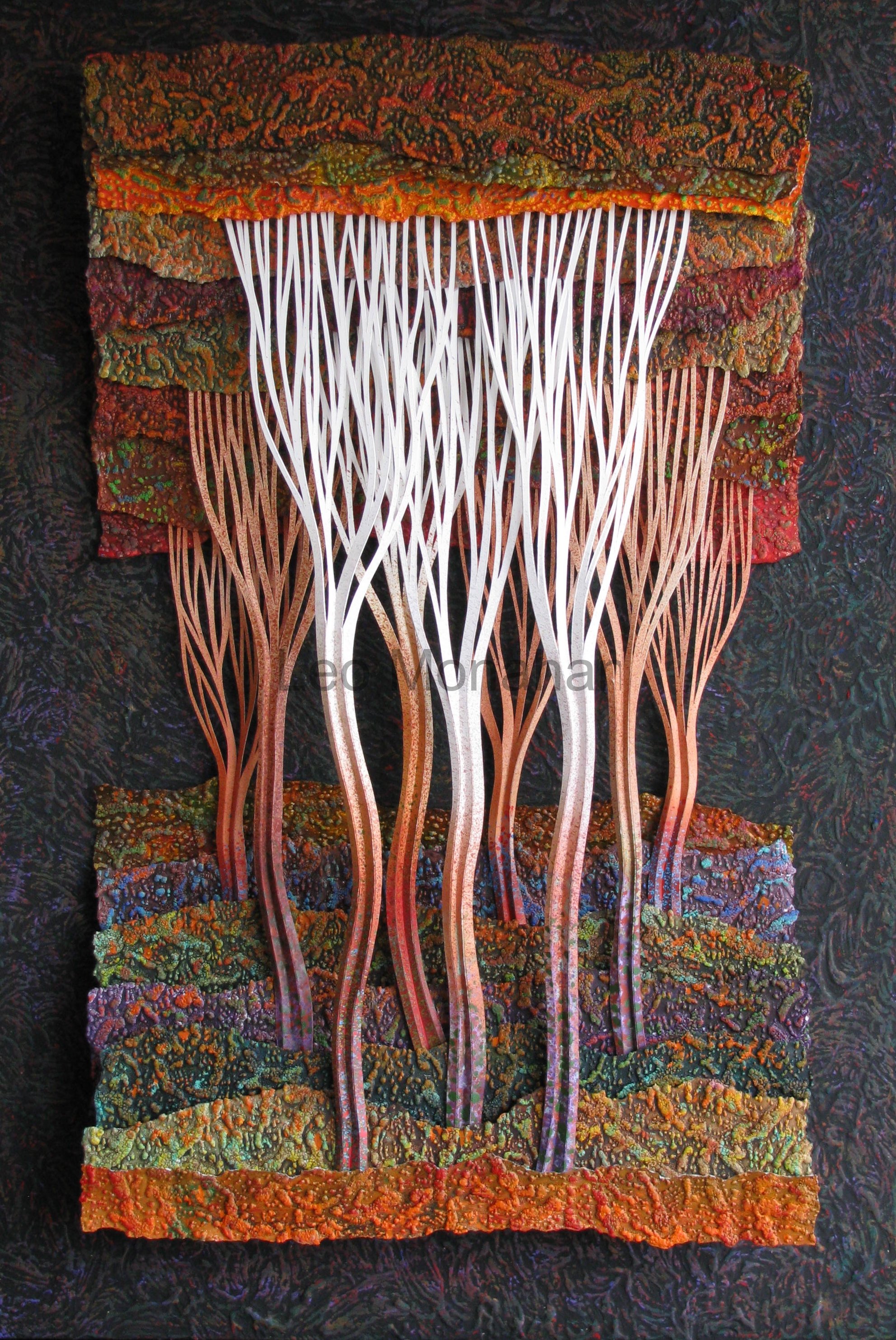
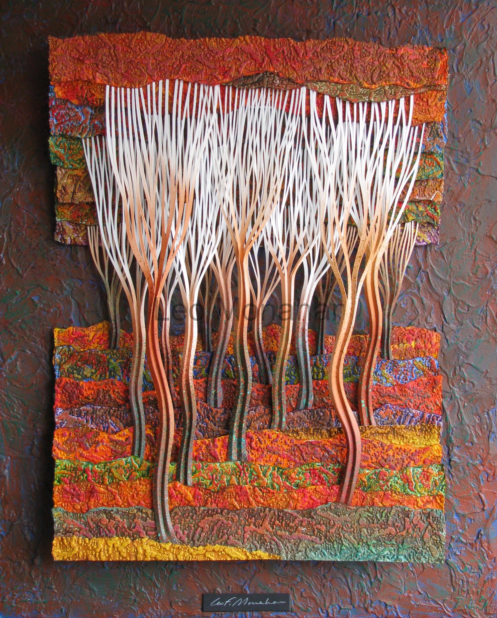
Feathers in the Wind

In my art I try to tell stories about seasons, conditions of age, heat, cold, and, in this case, wind. The feathers are old, nearly blown apart by the wind, left behind, and are somewhere where no one ever sees them. They’re fugitive, and they’ll be gone soon.

Old feathers out there,
Torn apart by the hot wind.
Are past life’s treasure.

I used a number of techniques in this sculpture. I painted a heavy, impasto background, brushing, sponging, splattering, and oxidizing the various elements. As before, I cut, manipulated, painted, and assembled them, in that order. It’s always a challenge and
an adventure.

Hands covered with paint.
Thrilled by color on paper.
I need a bourbon.

I’m never content with what I know,
only with what I can find out. 

Thanks for visiting me…

leo

Rhino Color Wheel is $1000.

The abstract is $500.  A similar one, Clouds, is available at the Cut, Bend, Fold, ColorColorColor exhibit at the Grovewood Gallery.
Japanese Maples in the Wind is $2,450 and is at the Cut, Bend, Fold, ColorColorColor exhibit at the Grovewood Gallery.

Whales in the Forest

Dear reader,

When I moved to the mountains in Western North Carolina, my palette became warmer because of autumn. The mountains go crazy with color in the fall and won’t be ignored. When I was a boy in the Black Hills, autumn came on a Wednesday and then we had three feet of snow for the weekend. Besides, Ponderosa pine needles don’t change color so there was no change from summer to winter. I lived in Los Angeles and we had four seasons, but they were fire, flood, earthquake and riot. There was no autumn influence in my fifty-year incarceration there.

The personal choice of color is subjective, and we choose color that makes us comfortable. Professional colorists select it to affect emotion, comfort, purchasing, identification and a myriad of results. Artists of every stripe can be objective in color selection to solve problems or accomplish goals, but personal color selection is subjective. Warm color preference is my style and “my style” has been called “the sum of my bad habits.” Now and then, I’ll do a dominantly cool piece, which I usually set aside for a period of time and view with suspicion.

When I got to North Carolina, my wife already had painters working on the living room. They were using a good white and two soft neutrals of the beige persuasion. I’m not comfortable in a visually safe, monochromatic environment so I added a bright, chrome yellow for a wall in the large entrance, a bathroom, two walls in my studio and as accents around the kitchen windows and the fireplace.

When the painters picked up the yellow paint the clerk asked if they were going to paint lines down the highway. But when the job was finished one of them said, “Mr. Monahan, I thought it would be garish, but it works!” I explained that it was the amount of yellow that we used. The contrasts of amounts used (variation of proportion) is the primary consideration in every choice of any element in art. My definition of design for any art is the study of proportion. Big is big when compared to something small, red is brightest when compared with a touch of green, and so on and on and on. Name any art and I’ll show you how the artist has used variations of proportion.

Leo Monahan Paper Sculpture

I began designing the “Spouting Whales” color wheel’s variation of proportion by thinking about a whale’s physique. It is bodied with undulating shapes starting at the nose and ending at the tail in a spiral. The overlapping whales assume hidden bulk. The underbody blends from white into tints (the addition of white) into pure color in a smaller proportion than the upper body, which starts with a modified or neutral version of the same color that blends into a darker value (dark & light) at the center. I toned down the colors with the addition of the direct complement (the opposite side of the color wheel). This is getting “teachy,” but I don’t have another way of describing things. The darker body color is blended with raw umber, an earth tone.

The spouts are the direct complement of the underbelly. For example, the violet whale at the bottom has a yellow spout and the yellow whale at the top has a violet spout. The star shape in the center is visually insistent and the eye starts there then moves out in large spiral shapes and is rewarded by the small accents of the bright spouts. All of the hues (color) have been tinted with white to about 75% for contrast, and the whole wheel is mounted on black to enhance the colors.

Joseph Albers, who had been a Bauhaus student under Itten, modified the color course from what it had been under Paul Klee and Kankinsky, expanded it to a full year and put it into the rational system that I studied under Bill Moore and then taught for many years. Albers was one of the instructors who came to America after the Nazis closed the school and he worked, taught here, and became the famous painter that we know. The list of famous artists that came out of the Bauhaus is impressive to say the least.
Read the history.

img_0216

Aspen groves grew near water and took over when forest fires killed the pines. They were favorite places to play when I was a boy in the Black Hills. They could be deep and dark, white but non-threatening. The first forest is narrow (20×30”), and has a strong vertical thrust which is enhanced by the tall narrow trees that move up from dark to light. The negative spaces between the three main trees are very strong, wavy flames that point up to reinforce the vertical direction. Referring back to the list of elements and coordinating principles, the layout is the dominantly vertical direction of trees with a horizontal subordinate of landscape.

The color is limited to variations on earth colors, burnt sienna, raw sienna, burnt umber and raw umber. I don’t use them right out of the tube; I add small amounts of color to give them character. There are dozens of bright color accents in the shapes of the forest floor. The paper is heavily embossed and painted in variations of the earth tones. The color accents hit the higher embossed shapes.

The values (dark and light) are dominantly dark with a subordinate use of white, but the white trees make up the main interest with their negative spaces and textural overlay.

img_0219

This forest has a more passive direction (24×30”). While the elements and techniques are the same, the intent is to pull you into the forest instead of up into the top of the trees. The visual flow is along the strong diagonal tree arrangement as they recede among the overlapping horizontal landscape shapes. It’s the same forest with different ideas.

“I wonder whom these woods belong to. I’m not sure I’ll walk through there even though it would be a short cut. It’s dark and gloomy with rough rocky ground and brush. What if I fell and injured myself? No one would ever find me. Wait…what was that? I think I saw something moving. Just another reason not to go in there but it’s probably my imagination. No, dammit, there’s something in there…Oh, jeez, it’s two little boys and a dog.”

“What were you doing in there boys? Is that dog friendly, will he bite?”

“We always play there and my dog will lick you all over. Do you walk in the woods mister?”

“Oh sure, I’m in there a lot, I just I love the deep, dark woods. Big people aren’t afraid of places like this y’know. I’m not going through this time but when I’m here again, I’ll just traipse right in there and wander around and have a lot of fun.”

“Ok mister, we gotta go home for lunch. G’bye.”

“G’bye boys…. Jeez.”


Thanks for visiting with me…

leo

The first Forest, Black Hill I, just sold. The second forest, Black Hills II, is available for $3200 at the Cut, Bend, Fold, ColorColorColor exhibit at the Grovewood Gallery in Asheville, NC.