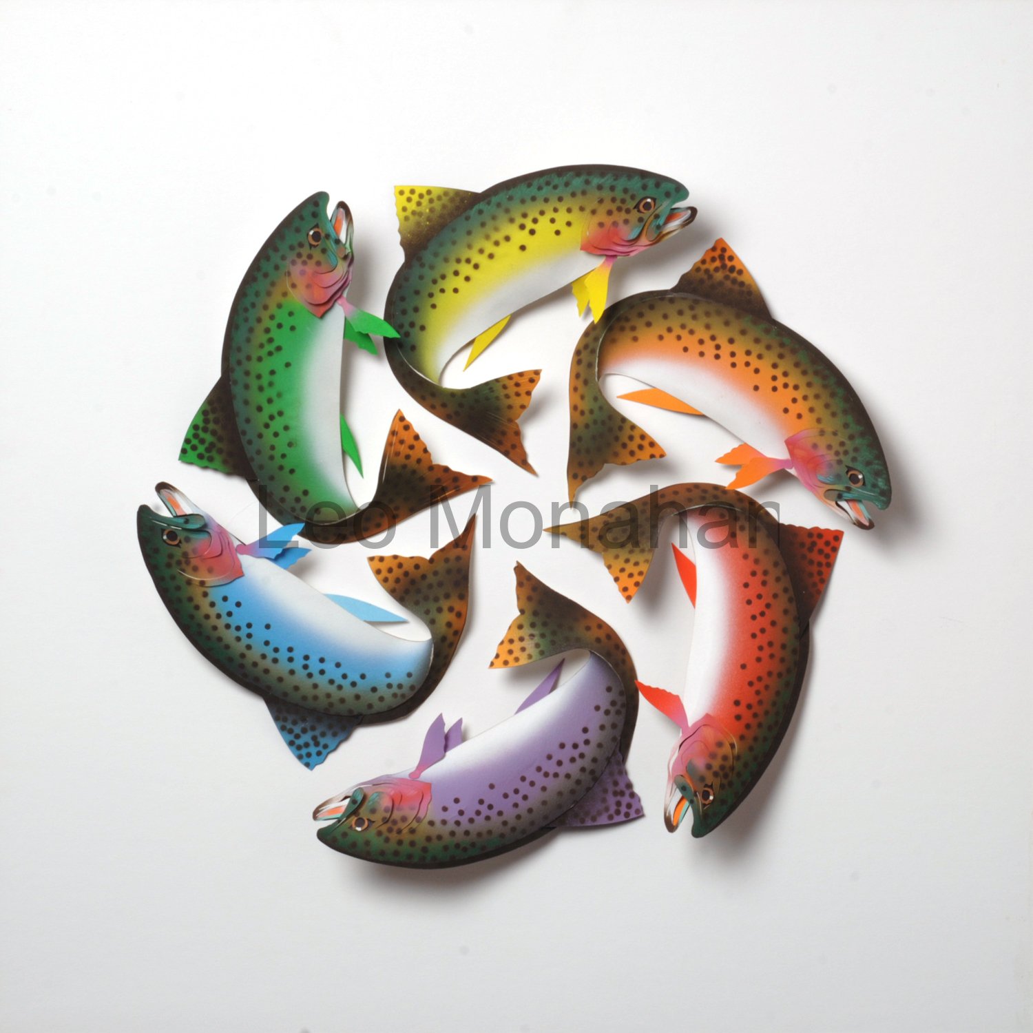
About admin

Leo Monahan is a pioneer of paper sculpture. His works are truly original with each piece being carefully designed and skillfully cut by hand. You could say that as a paper sculptor, Leo draws with his knife and as a paper artist he designs with the talent of an accomplished graphic artist and illustrator. Leo's works are for the most part inspired by his memories of life as young boy at the foot of Mount Rushmore. It was a life peopled with miners, loggers, cowboys, farmers, and the Sioux. One sees in his paper sculpture symbols of elements that surrounded him at that time, especially exotic plants, animals, masks, fishing flies, and wild bird feathers. Leo is unique in portraying these images and evoking feelings with the paper sculpture collage medium. His creations are a blend of Impressionism and Surrealism, and they come together to tell stories.

Them’re Good Eats

Dear Reader,

Food Colorwheel

“Them’re good eats,” one of my friends says when Matt serves up breakfast at the Saturday farmer’s market here in Barnardsville, NC.  After taking everything into consideration, such as eating too much or starvation, I’ll take eating too much every time.

My “plate full of food” color wheel is painted in the three primary, red-yellow-blue, and the three secondary ones, orange-violet-green. The secondary colors are the direct complements of the primaries. The food shapes are the commonly accepted colors of yellow for bananas and lemons, red for apples, and tomatoes, green for scallions and asparagus, etc., etc., etc. You’d be confused if a Navel orange was suddenly Army green or Air Force blue.

As a child of the depression, I ate every mac of my “mac’n cheese”, and always had enough to eat, so why was I such a skinny teenager? We ate lots of poached deer, elk and antelope. “Poached” refers to how we got it rather than how we cooked it. Canning was very important, and we ate out of rows of Mason Jars full of color and good tastes all winter long. The color and taste of food seem to go together.

The harvest is on now, and the colors of the fresh fruit and vegetables are breathtaking. If you’ve never been to a county fair and seen the endless displays of “canning” for competition, then you ain’t never seen no color, not really.

Mason Jar I

A war started, and I thought the Army would send me to Korea to live in holes and eat C-rations, so I joined the Navy. In a matter of three months at boot camp, I gained 20 pounds and grew 2 inches. I was finally being nourished.  Remember, I told you my mother thought that burnt pork chops was a recipe.

Fast forward to Los Angeles, the GI bill, the Chouinard Art Institute, and the first Disney scholarship. I discovered Langer’s Deli, Edward’s Steak House, and a good Mexican restaurant close to the school, which was by MacArthur Park.

When you live in LA, you only need three kinds of restaurants to survive, a Mexican, a Chinese (in Chinatown), and an “open all night” Jewish deli like Canter’s on Fairfax. You always had Dos XX, Tsingtao beer, and Cel Ray Tonic. All other restaurants are “bonus eating.”

Four Plates

From the substantial time I’ve spent outside the U.S., there are a few foods etched in my gastronomical memory: sushi in Japan, Christmas tamales and pupusas in El Salvador, wurst and schnitzels in Germany, pub food in England, dim sum in China, and almost anything in Italy  (but mainly the gelato). If I can swing it, I eat ice cream every day, and gelato in Italy is a dream.

Gelato

I close with a song from my food appreciation past:

Fried ham fried ham cheese and baloney bananas and jello
and after the macaroni we’ll have onions pickles and pretzels
and then we’ll have some more fried ham
Fried ham fried ham fried ham fried ham…(Repeat 10 times, fast!)

Thanks for visiting with me. Tip your waitress.

leo…

I’m never content with what I know,
only with what I can find out.

Food Colorwheel is $1200. Sold 10/24/12
Mason Jar I is $500.
Four Plates is $800.
Gelato is $900. Sold 10/27/12 at the Weaverville Art Safari

My work can be purchased at the Grovewood Gallery on the grounds of the Grove Park Inn in Asheville, NC. Click on the gallery link if you are interested in taking one of my workshops.

Please plan to attend the opening of my three-month exhibit at the Grovewood Gallery to help kick off American Craft Week.  The opening is Saturday, October 6th, from 4-6pm. Music by Bruce Lang, good eats, lively conversation, and a paper sculpture demonstration by yours truly.

Cut, Bend, Fold, ColorColorColor Exhibit Invite


Rainbow Hands

Dear reader,

Here I am again. This is blog number two. If you want to know what these blogs are about you can review my first blog. We’re talking about basic design and color theory as it relates to my work.

Johannes Itten left the Bauhaus in 1923 and his book on color was published in 1960. In the more than 50 years since I left Chouinard, I have absorbed many other ideas and modified the preliminary or foundation course as culture and styles have changed. Other design schools and instructors all over the world have done the same. I hope you realize that styles may change, but the elements and coordinating principles stay the same. The elements are: line, shape, form, space, texture, value, and color. The coordinating principles are: proportion, contour continuation, repetition, positive-negative, direction, transition, variation, dominant-subordinate, active-passive, and advancing-receding.
I’ll try to talk about them as I show my work.

Itten’s color system is what I taught and have used since 1957. In the last blog I showed the color and design elements involved in the “Faces” logo for this blog, as well as another color wheel I call “Color Whales” which came about after “Rainbow Trout,” another visual pun that I made when I was trying to sell stuff to Trout Unlimited.

Leo Monahan Paper Sculpture

As you can see, I sculpted the trout realistically and painted the three primary and three secondary colors on their sides. I selected yellow, red, blue, orange, violet, and green to complete the color wheel. The colors are slightly modified or neutralized by the addition of white. The pattern that the tails make was serendipitous. Some things just happen happily. I like this one and won’t sell it, unless someone offers me some money. It reminds me of my childhood in the Black Hills. A trout stream ran through my back yard; where I used a willow fishing pole to drown a lot of worms until the older boys taught me to catch trout with my hands. The worm population was safe.

Paul Klee, who took over the course when Itten left, said that circles flowed, squares were calm and triangles were dynamic. The Trout color wheel certainly flows because of the spinning direction of the arrangement. Speckles on the trout are symbolic of any dot pattern on trout and the fish have a small white spot for the reflection on the eyes that indicate life. These trout could be any trout. The rainbow, in “Rainbow Trout,” is the wheel’s main concept.

I was in Berlin a few years ago and visited the Bauhaus Archive. I explained the Chouinard connection to the curator and he showed me through an exhibition of Paul Klee’s students’ work from the post-1923 foundation course. The students’ design problems were eerily similar to those at the Chouinard Art Institute. He was surprised to hear that Walter Gropius, founder of the Bauhaus, had visited Chouinard between the time that he brought the Bauhaus school to the United States and my arrival at the school. He spoke to the students at that time, but I was in Korea and missed it. Mrs. Chouinard, who founded the school, was ahead of a lot of other art educators, and we all loved her.

Leo Monahan Paper Sculpture
This “12 Hands” color wheel is another of the 24 color wheels in the series.
The repetition without variation of the hands seems simple on first blush but on further examination you will find six more color wheels other than the hands themselves. If you start at any yellow thumb and move right through ten fingers, you will see a ten-color series. I left out two colors in the 12 tone color wheel but I can’t remember which ones and, really, who gives a damn. The colors are tinted to about 80% of full intensity and the arrangement is mounted on black. White tends to diffuse color and black intensifies it. The trout were mounted on white for contrast because the fish are very dark. These are simple considerations but necessary for contextual continuity.


This piece was one of a twelve-bird calendar series done for Technocell, a German specialty paper company. I think this one, “Mocking Birds Mocking Flowers,” was for the month of May. I don’t know how many flowers there are but I just put on some Mozart, went into automatic mode and cut the damn things. They are all exactly the same and painted intense yellow with a few soft pink accents. Yellow is the most intense of all color. Pure sun! It can be hard to control because of its brilliance but, used as a subtle dimensional background, it works. The leaves are just two steps away on the color wheel, so they don’t visually interfere; they serve to enhance and identify the flowers.

As for the birds, this is one of those ‘watch what the hell you’re doing’ jobs.
I haven’t counted the number of shapes in each, but every bird has the right number. The birds are all the same so I only had to design them once, trace every shape, and cut them seven times. Thank the Force that I designed them all going the same way. These are ‘Leo’ birds and there’s not much that is accurate about them. Everyone believes they’re mocking birds, so I’m happy.

The color combinations on each bird vary and involve fully intense (bright) color. The hues are toned down by adjacent or direct complements and white. For me, I almost never use black, as the combination of color mixed with black makes for flat, lifeless color (although such combinations are occasionally useful for variations in neutral comparisons and is called “shading”).

Technocell took me, and the twelve paper sculptures, to Cologne, Germany, where the company displayed them in its booth at a huge paper and printing ‘messe’. It was the biggest damn show I’d ever seen. Ten of the twelve were purchased the first day. Another went to a designer in Germany and ‘July’ went to the head of Coca Cola in Japan. I got to visit that one while on a workshop trip to Tokyo where I worked with first-year students at the Tokyo Communication Arts schools. (I’ll talk about those trips in later blogs.) The topic was ‘Problems of Creativity’ for first-year art students.

Selling the original art meant that I got paid twice. I love art for money’s sake. There have been requests for sizes, prices and availability and I’m working on that, but most of the art I show is from my archive. In the next segment, I’ll show another color wheel and gallery art that came out of my childhood experience in South Dakota’s Black Hills.

Thanks for visiting with me…

leo