A Summer Day, Work & Play

Dear Reader,

May 25th. I remember anticipating the coming summer vacation when in the 4th, 5th, and 6th grades. Shoes and shirts off, strap overalls. No underwear until school started in the autumn. Keystone, SD, in WWII was a dream for boys. The Black Hills were our playground with the granite mountains, ponderosa pines, streams and lakes, all in sight of Mount Rushmore.

Playtime was precious because the men had gone to war, and we were left to take up the slack. We had chores, but not one of us felt put upon. I fed chickens, gathered eggs, cleaned the coop, slopped the pigs (I was scared to death of the big pigs), sawed logs with a small, one-man crosscut saw, split the wood, and put it in a wheelbarrow. I wheeled it across a wide farmyard, across the creek and into our house and my grandfather’s house. I had my own small axe, which I threw until I broke the handle.

I had to fill the wood-box for the cook stoves and for the pot-bellied heating stoves in both houses. That was a lot of sawing, splitting and wheeling for a little kid, around eight to ten trips in all. If you didn’t finish, you would be out there in rain or snow until you did. A few of the boys had cows to milk, butter to churn, and horses to take care of on top of everything else.

Guernsey Cows

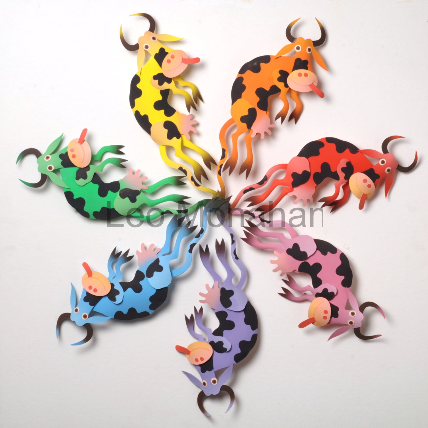
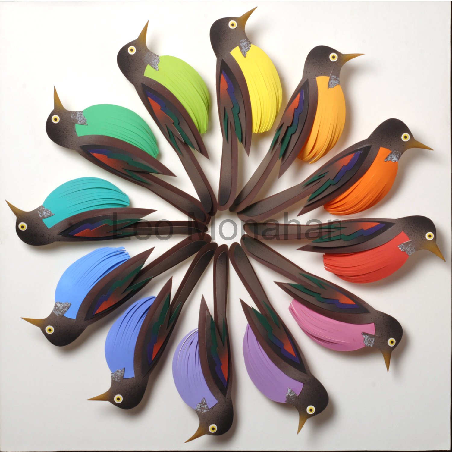
In spite of the work, we always fished, hiked and climbed those granite giants. This cow color wheel is my symbol of those days and how we felt about life. The colors include the three primaries yellow, red and blue as well as the secondary hues orange, violet and green. All are at full intensity (purity), as bright as a bunch of balloons.

I put black spots on the cows because I always liked the black-and-white Guernsey cows best. We didn’t know about cow tipping, but we did know about dried cow-pie tossing, especially at each other. A laughing boy’s organic frisbee.

Vladimir&Estragon

These figures were done for the run of Samuel Beckett’s “Waiting for Godot,” for which I had done the set. Vladimir and Estragon remind me of us boys waiting for summer vacation, which, like Godot, never seemed to come. Sometimes the things you really crave never show up; I work in the moment and stuff shows up.

The figures are roughly sketched and then drawn with a knife, cutting them from museum board, which is usually used for acid-free mats. The strips are torn from waste paper; I save every scrap that I think has possibilities. I want the striping to look unplanned, with great variations in texture. The colors are random, but there is always play between warm and cool, dark and light, bright and neutral. The color scheme is dark, which enhances those variations and comparisons; I quit when it yells at me to stop.

It’s as if my design and color knowledge were in a fanny pack, and when I need a solution and reach for it, it’s always there. Serendipity is my guide, creating life as I want it to be. Whatever happens should happen naturally.

The boy, Pozzo & Lucky

Here is the rest of the cast of “Godot” on a dark background of neutral burnt orange, dry-brushed over a deep forest green with some black in it. There are the boy, Lucky, and Pozzo. I think of them as Jack, Raymond and Jim, or any of the boys in Keystone.

Sadly, there are only two or three of us left.

Thanks for visiting me.

leo

The two “Godot” pieces are available for $850 each.
They are varnished, unframed and should remain so.
leomonahan@tds.net

The Grovewood Gallery is now representing me in the Asheville, NC area

Vladimir


Robins & Butterflies

Dear reader,

It’s still that sweet time of year when it rains regularly and the earthworms come out to keep from drowning. Why did we call them angleworms? We dug them up behind barns, in that kind of soil, and put them into a flat Sir Walter Raleigh tobacco can, and gone fishing. Well, no matter what the worms are called, the robins are getting as fat as groundhogs in a bean field. Go rockin’ Robin cause we’re really gonna rock tonight!

When I designed this color wheel I thought of robins’ inalienable rights. The right to be a robin blue breast as well as a robin red breast. Some of them would probably wear plaid or polka dots if they were available. Robin paisley breast or robin tie-dye breast would look outstanding, but white with a black bow tie for eveningwear would be so gauche.
Did you know that the French don’t have a word for gauche?

Leo Monahan Paper Sculpture

The robins’ breasts are intense colors slightly tinted by the addition of white for clarity.
The 12 hues in the color wheel were named so they could be easily remembered. The spectrum starts from ultraviolet and leaves as infrared. Simple names: yellow, yellow orange, orange, red orange, red, red violet (magenta), violet, blue violet, blue, blue green, green, yellow green. Yellow is in the center of the spectrum and is the brightest, most intense color. Itten said that 12 colors were easy to remember, and didn’t think anyone could describe number 84 in a 100-color wheel.

The robins’ body feathers are a restrained combination of dark earth tones and black, with a touch of deep green and dark red accents on the wings, to contrast with the bright colors and the white background. The breasts are the main symbol, so the feathers were cut in simple linear shapes, with long tail feathers that meet at the center.

When I was a boy, the robin was my favorite bird. They came early, were big and bold, strutted around with worms hanging from their beaks, and didn’t seem to take crap from anyone. In spite of the angleworms, I would prefer to come back as a robin in my grandpa’s back yard. I wish I was a kid again, doin’ what I did again, singin’ a song.
When the red, red robin goes bob-bob-bobbin along.

Nancy's Butterflies

Butterflies, mama nature’s tiny wing wavers. It has been said that when a mariposa waves its wings in Argentina, the result is a hurricane in Haiti. We have to find that butterfly and stop it!

It seems that every language has a sweet name for this bug: mariposa in Spanish, schmetterling in German and butterfly in our own. Everyone loves this flying eye candy. When designing the image above, I had to control the very decorative quality of the butterflies. If I had designed each butterfly with unique decorative patterns on the wings,
it would have been a visual disaster. The result would have been a freckled forest.

I cut, painted, manipulated and assembled the trees and other forest elements into a finished work that could stand on its own as the symbol of a forest in the fall. The dominant color range is warm, the trees are the major shape system, the indicated depth of the scene is shallow, and the value range is in the middle of dark to light. The forest becomes a containing device for the butterflies.

The basic shapes of the butterflies are a simple silhouette symbol that everyone can recognize. The sizes are nearly all the same because the range of variation had to be in color and placement. The forest is made up of a range of warm, neutral hues that contrast with the intense (pure) quality of the colors of the butterflies. The butterfly wings are all slightly textured. with numerous other colors in small amounts (proportion) to relate to the textured surfaces of the forest. Hopefully, the result is an explosion of color in the autumn, when the butterflies migrate, or become one with the leaves on the forest floor.

Butterfly Hands

Thanks for visiting me…

Leo

Four versions of “Butterfly Hands” are available at $300. each. 12×12”
leomonahan@tds.net